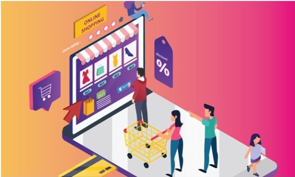
Adding an item to the shopping cart does not guarantee a purchase yet. Let’s consider what criteria the checkout process in an online store should meet so that users do not abandon their cart and still become customers.
The importance of a competent implementation of checkout and shopping cart for an online store
After you have invested resources in attracting visitors to the site, implemented a competent design of the product card and listing, and taken care of the navigation and search logic, it is a shame to realize that about 70% of users who added products to the cart refuse to purchase.
In other words, if the checkout process in your online store turns out to be inconvenient, one in five potential customers will abandon the cart. The good news is that by making the checkout process on your website quick and easy, you can significantly increase your revenue by allowing potential buyers to order. Want to know more? Need advice from a different perspective? Consider b2b eCommerce consulting.

Here’s how to improve your online store checkout process below.
Table of Contents
1. Make it possible to add a product to the cart from the listing
Sometimes the user does not need to study the product card in order to make a purchase decision – it is important to give him the opportunity to quickly add a product to the cart.
2. Add availability information to the product card
There is nothing worse than when, after paying for the order, the manager calls the buyer back and says that half of the goods are out of stock. And he offers:
- pick up products similar in characteristics;
- transfer money to the account in the form of bonuses;
- wait an indefinite amount of time until the goods arrive from the supplier.
Yes, there is a chance that the user will not go anywhere and agree to one of the options. Perhaps this time the online store will not lose a customer, but how profitable is it in the long run? Trust is undermined.
Be sure to display information about the quantity of goods in the warehouse both in the product card and in the basket. Or, do not show items that are out of stock.
3. Offer different payment options
You can say goodbye to the buyer if he does not find the usual payment method – therefore, it is better to offer all possible options.
4. Provide information about the cost of delivery in the product card
Let’s say a user found a product at the lowest price, but when placing an order on the site, he found out that delivery would cost a decent amount. The probability of placing an order in the online store is minimal. At the same time, he has already spent time searching for the desired product and the first stage of ordering. Disappointment is inevitable.
5. Show the date, not the delivery time
Users want to know when they will receive their order. Give them a specific date, or at least a range of dates, rather than force them to calculate. It is important for some visitors to know when to place an order in order to receive it by a certain date. Indicate when they will receive the goods if they order today, and when – if tomorrow.
6. Display the possibility of self-pickup in the product card
Users see pickup as another delivery option, so they expect to see pickup information next to the shipping information. It also helps you quickly compare options and assess whether the hassle of going to a store like Sugoi Mart is worth saving time or money compared to shipping.
7. Use clear CTAs
Use buttons with a clear call to action – “Add to cart”, “Buy”, “Order” – instead of the cart image or other non-obvious icons and buttons. It should be clear to the user how to order the product.
8. Focus on the button of an important target action
If you want the customer to perform the target action, make a visual accent on the corresponding button in the product card. Build a hierarchy of styles using colors or button shapes. Otherwise, the main and non-main calls to action (CTAs) on the page will turn into one red spot. And the user will not understand what they want from him in the first place.
9. Implement the “Buy in One Click” functionality
There is a special category of people among the visitors to your online store. Those who are used to saving their time and not wasting it on filling out forms. It is easier for them to “buy in one click”, and discuss the nuances of the order by phone. The functionality is not used by everyone, but in vain: in one project, only by adding the button “Buy in one click”, we increased the conversion by 15%.
10. Make the cart block informative
The following mistakes are often made in the design of the shopping cart of an online store:
- there is no basket icon,
- the icon does not associate with the shopping cart,
- there is no information about the quantity of goods in the order and the amount of the order,
- the block with the basket is not visually highlighted.
Conclusion
Now you know how to improve the checkout process in an online store, which means you can reduce the number of abandoned carts and increase your revenue. If you would like to create your own ecommerce website, contact the eCommerce development company.


